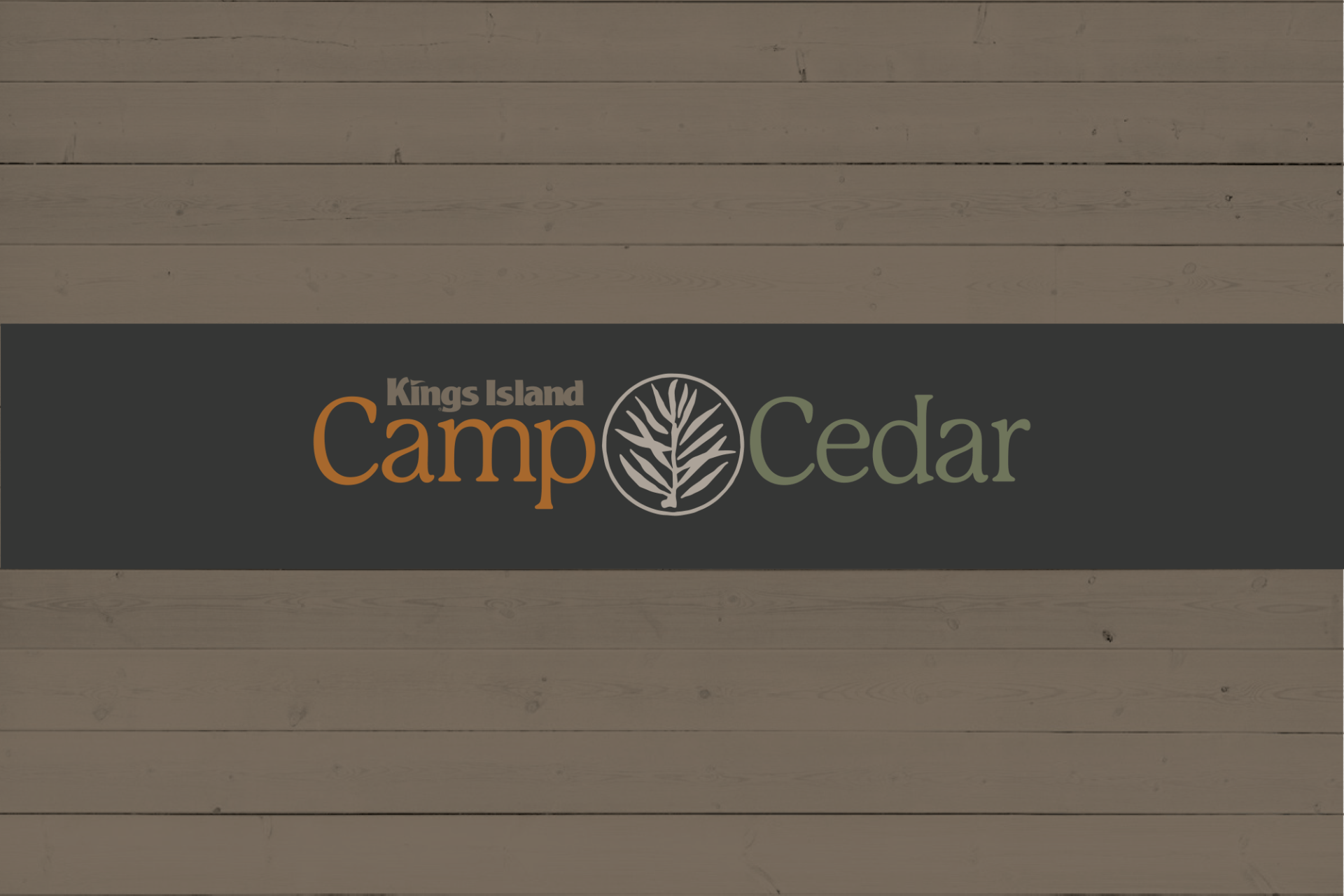
Camp Cedar
Across from Kings Island in Cincinnati is a new luxury camping resort Camp Cedar.
Artica Design was tasked with creating the corporate identity and the camp signage for the resort.
LOGO DESIGN
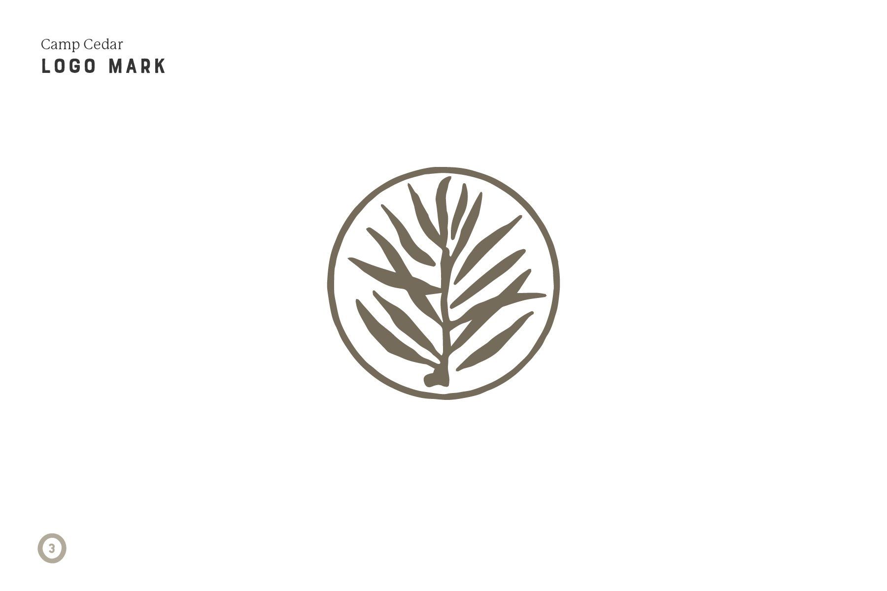
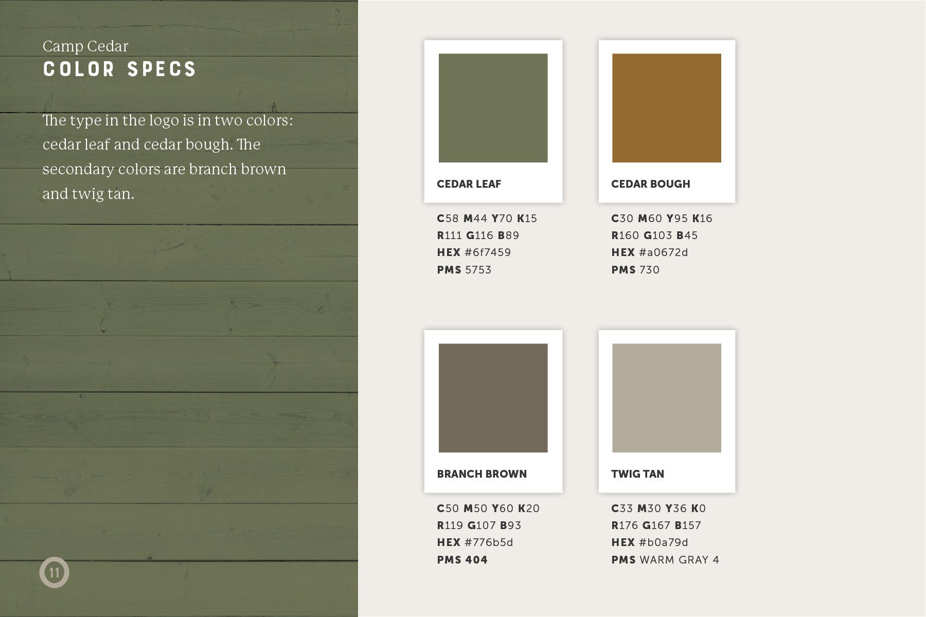
After settling on the name for the resort, I worked on several logo designs around the concept of the cedar tree. I wanted to keep the logo mark natural and earthy yet modern. I drew the cedar circle symbol in Procreate. I chose a soft cedar red brown and muted green with warm gray as the color scheme. I chose a logo font that was open and friendly, casual yet a bit upscale to reflect the direction of the resort.

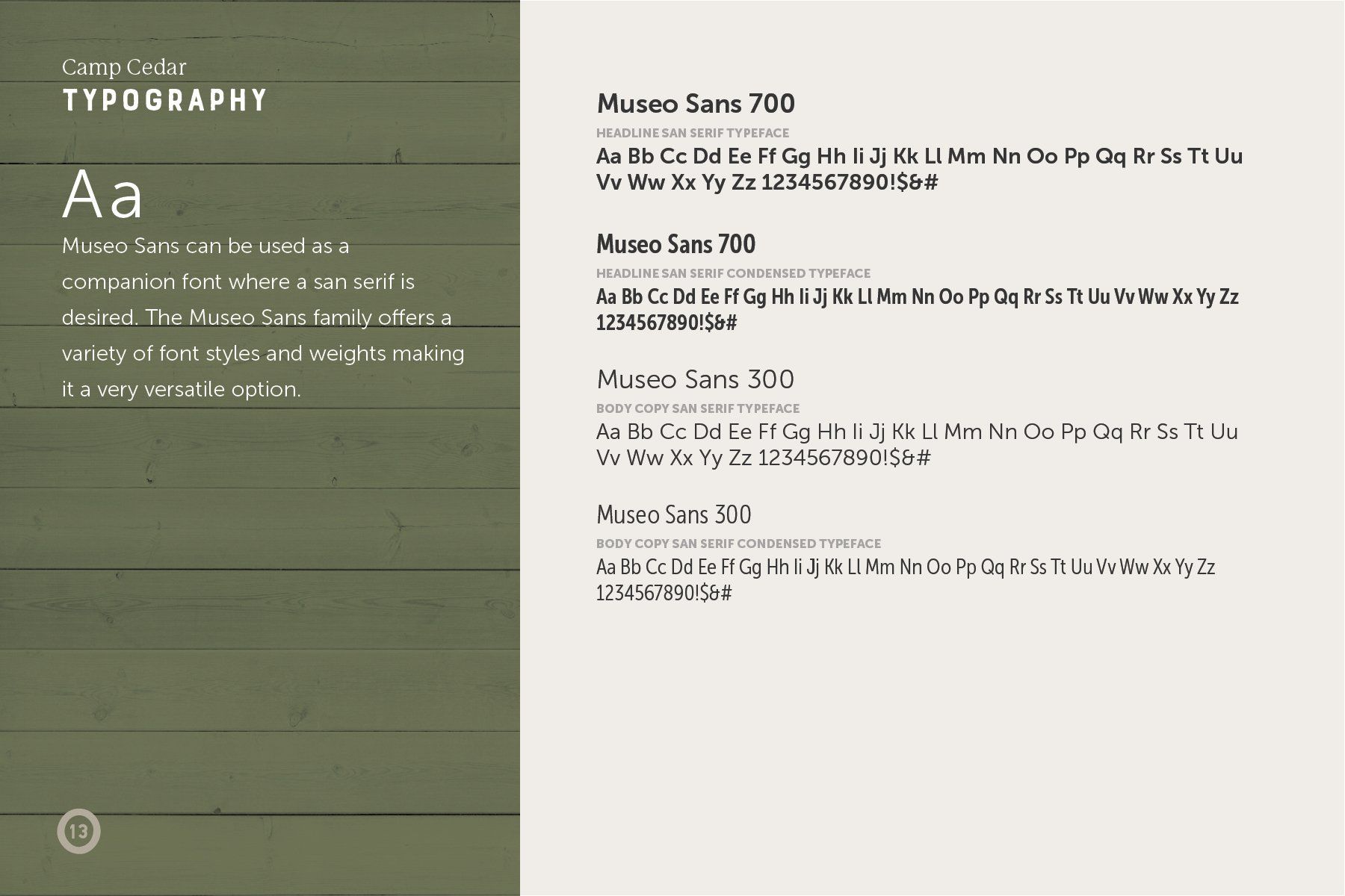
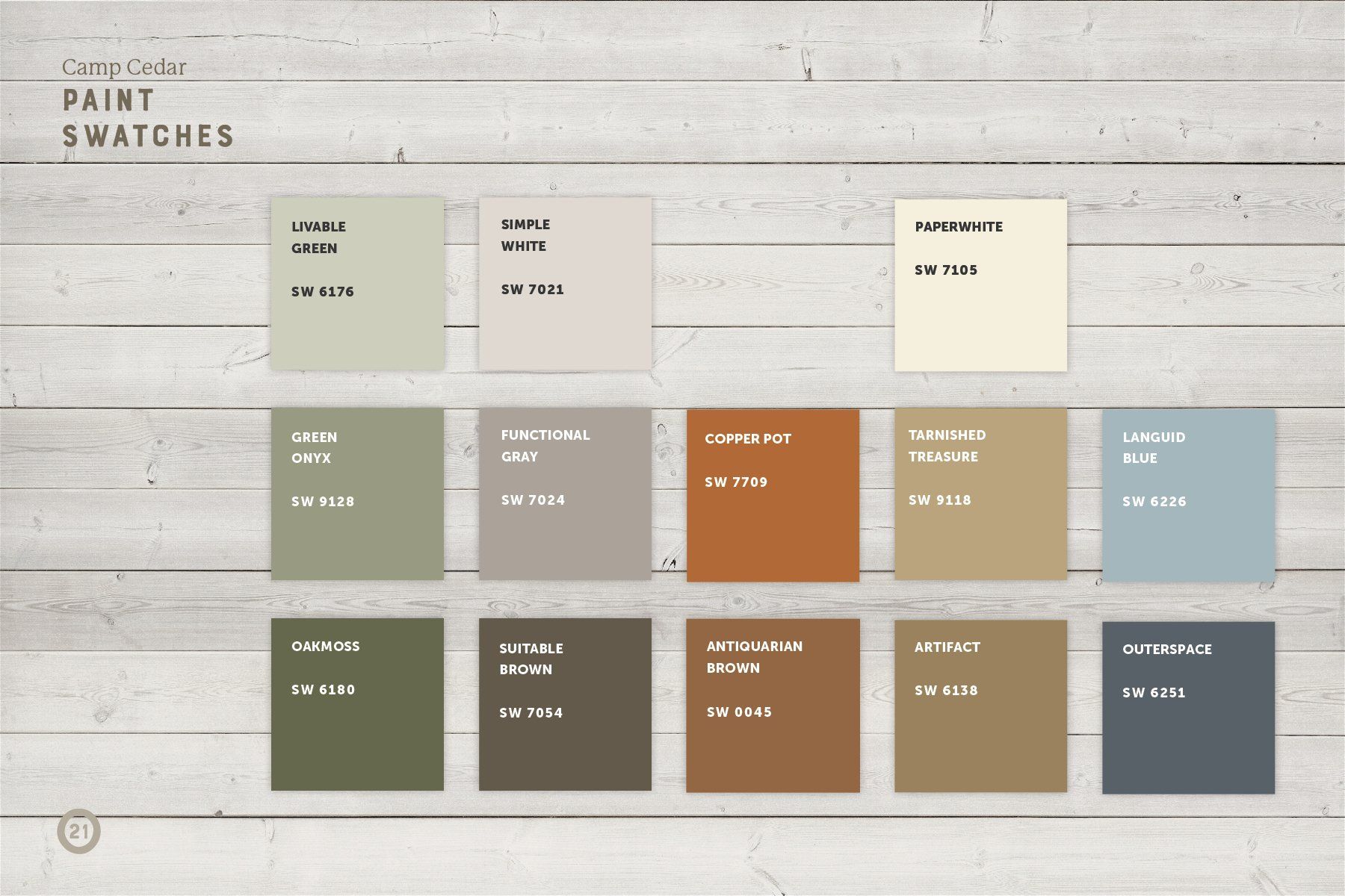
BRAND BOOK
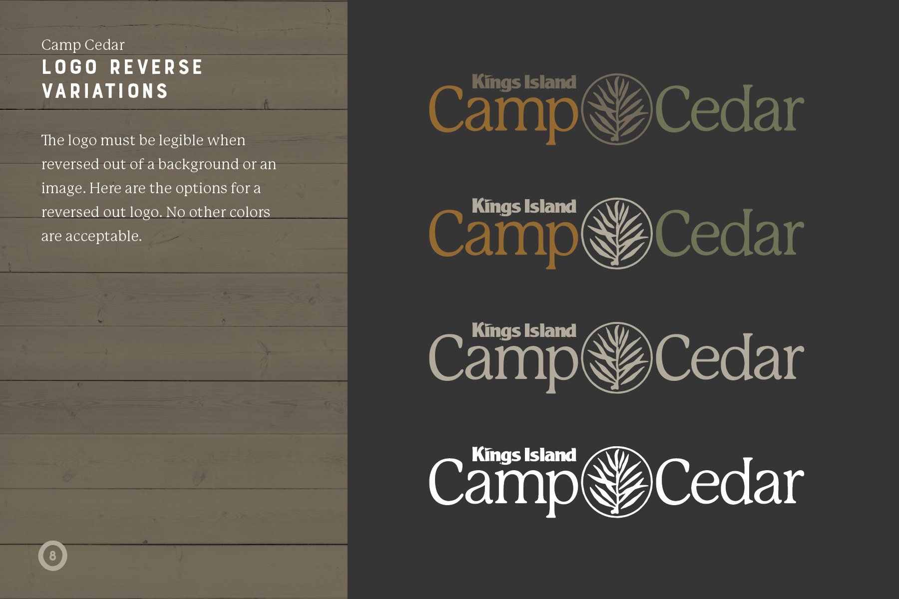
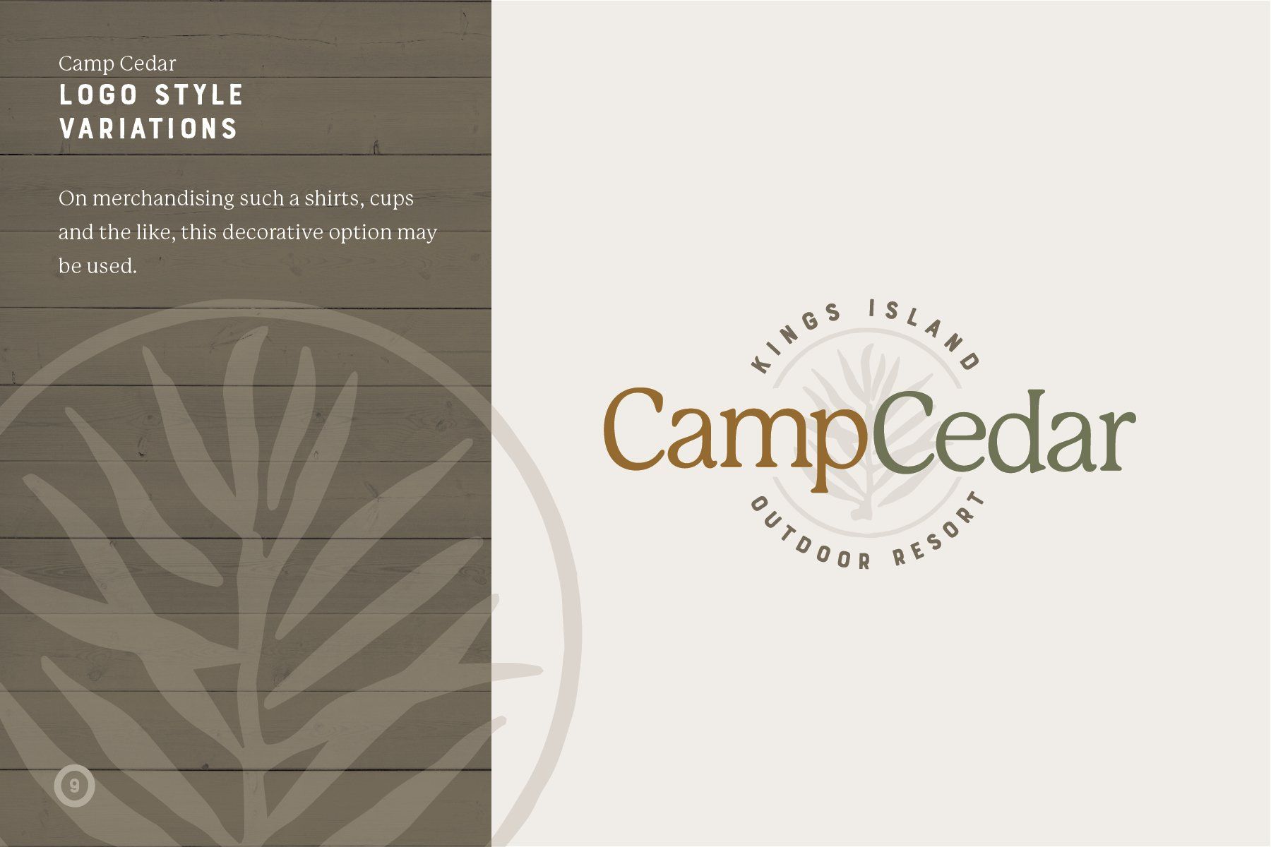
In addition to the logo I also designed a brand book to establish logo and font usage as well as designate color usage throughout the park.

City skyline


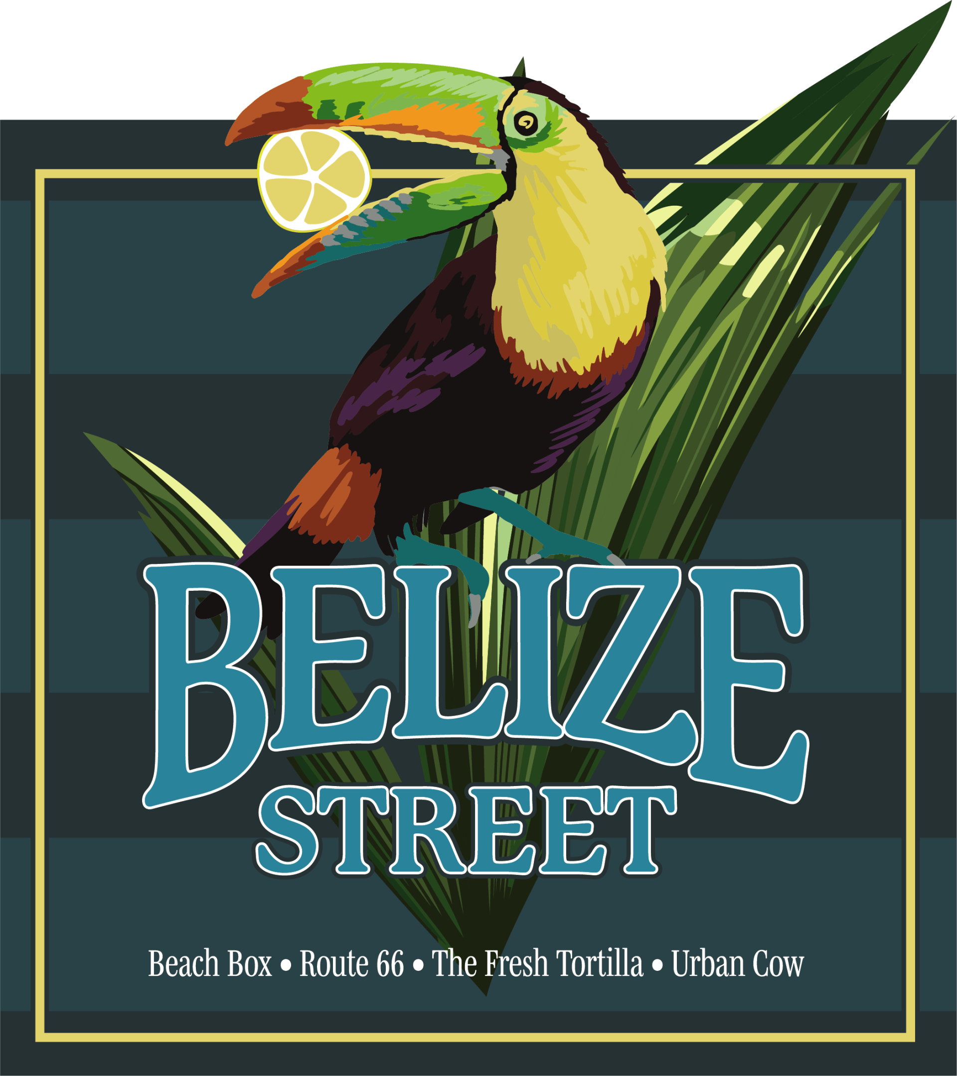
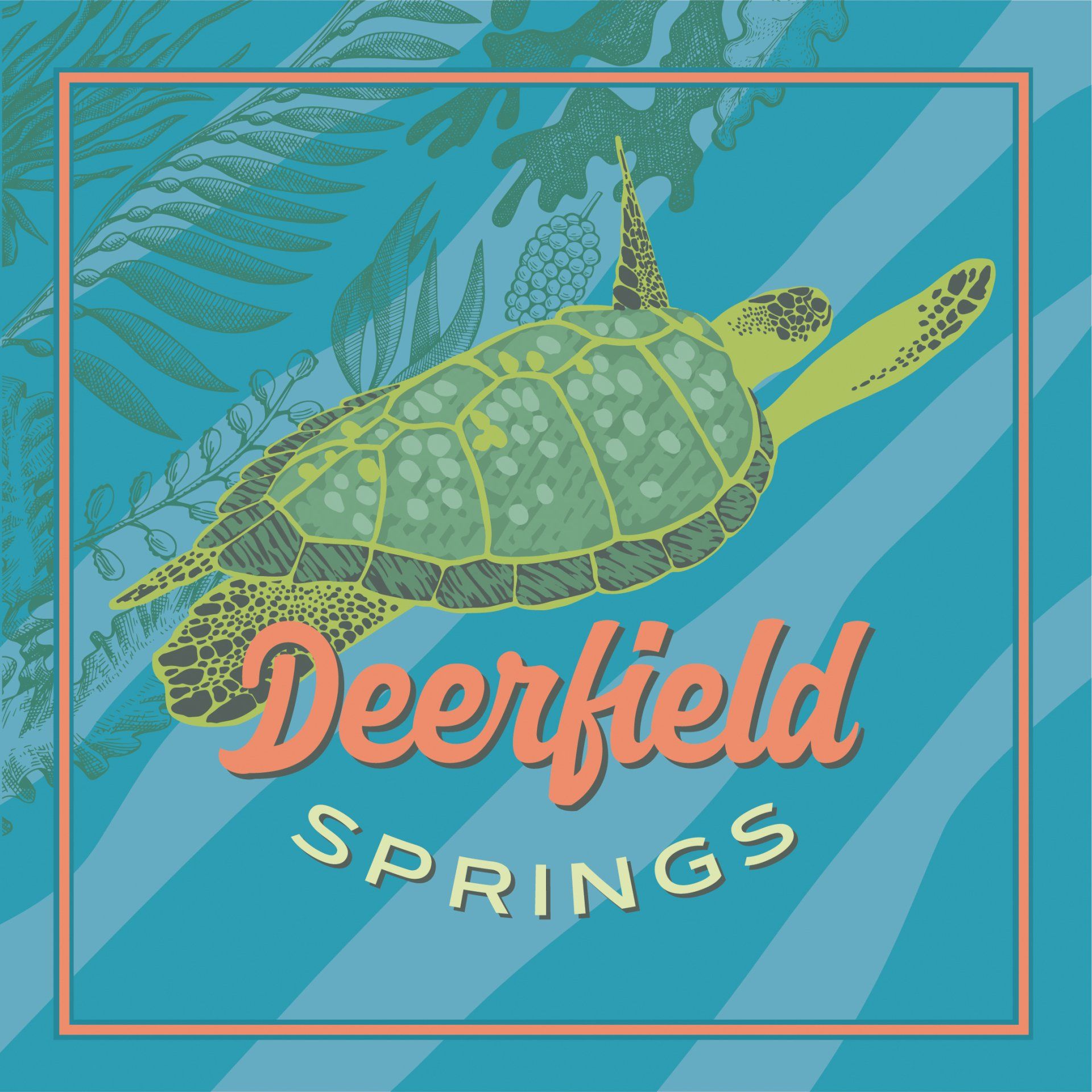
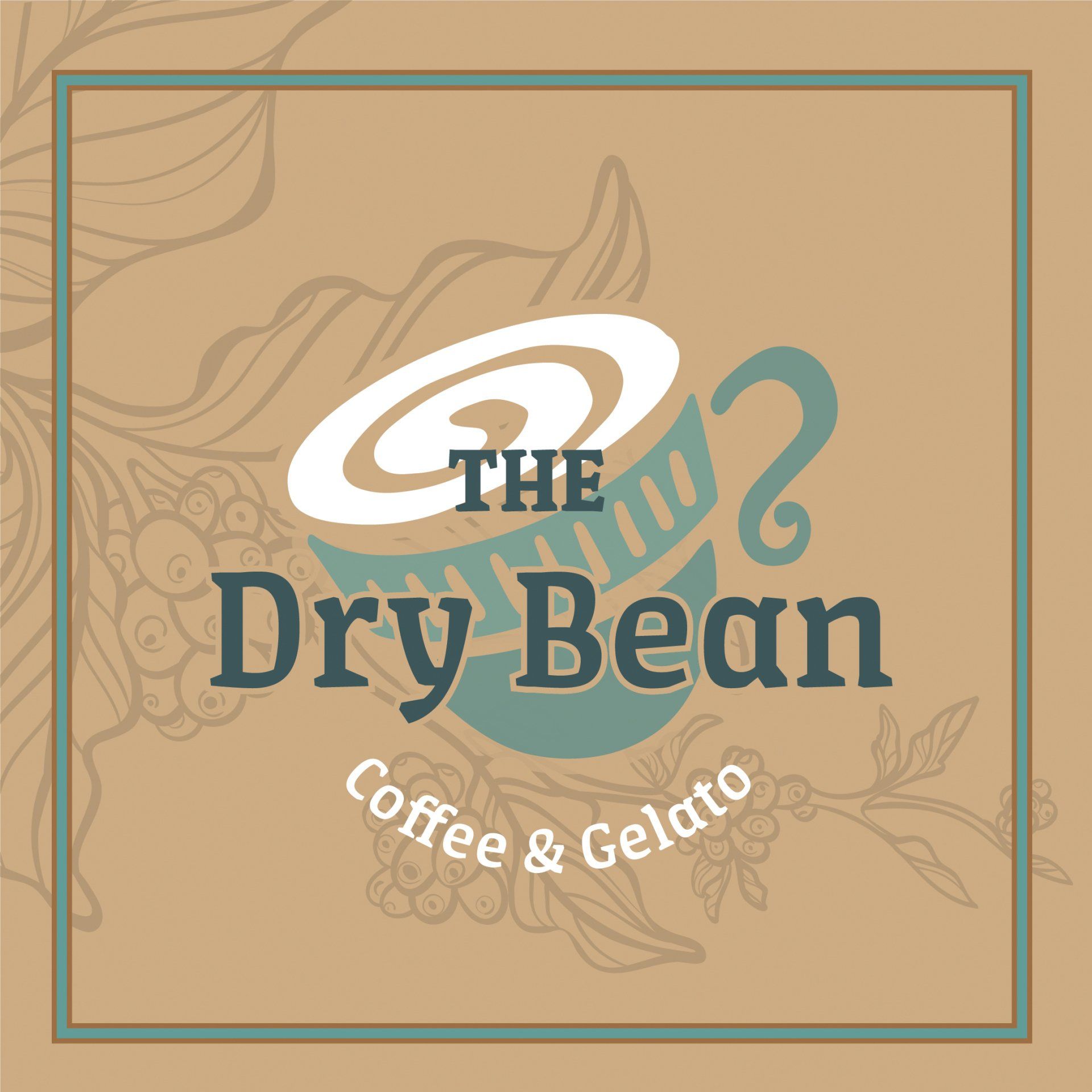
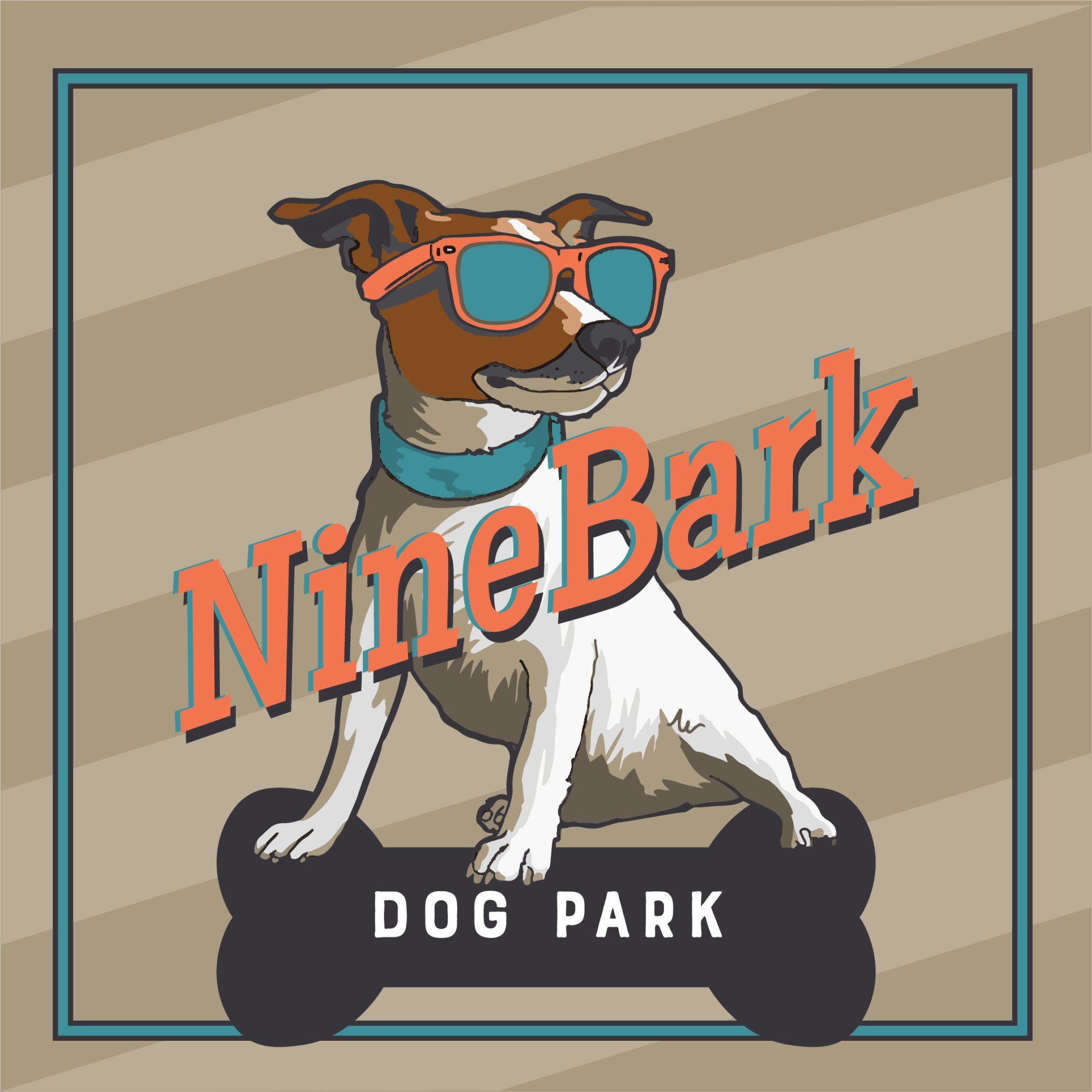
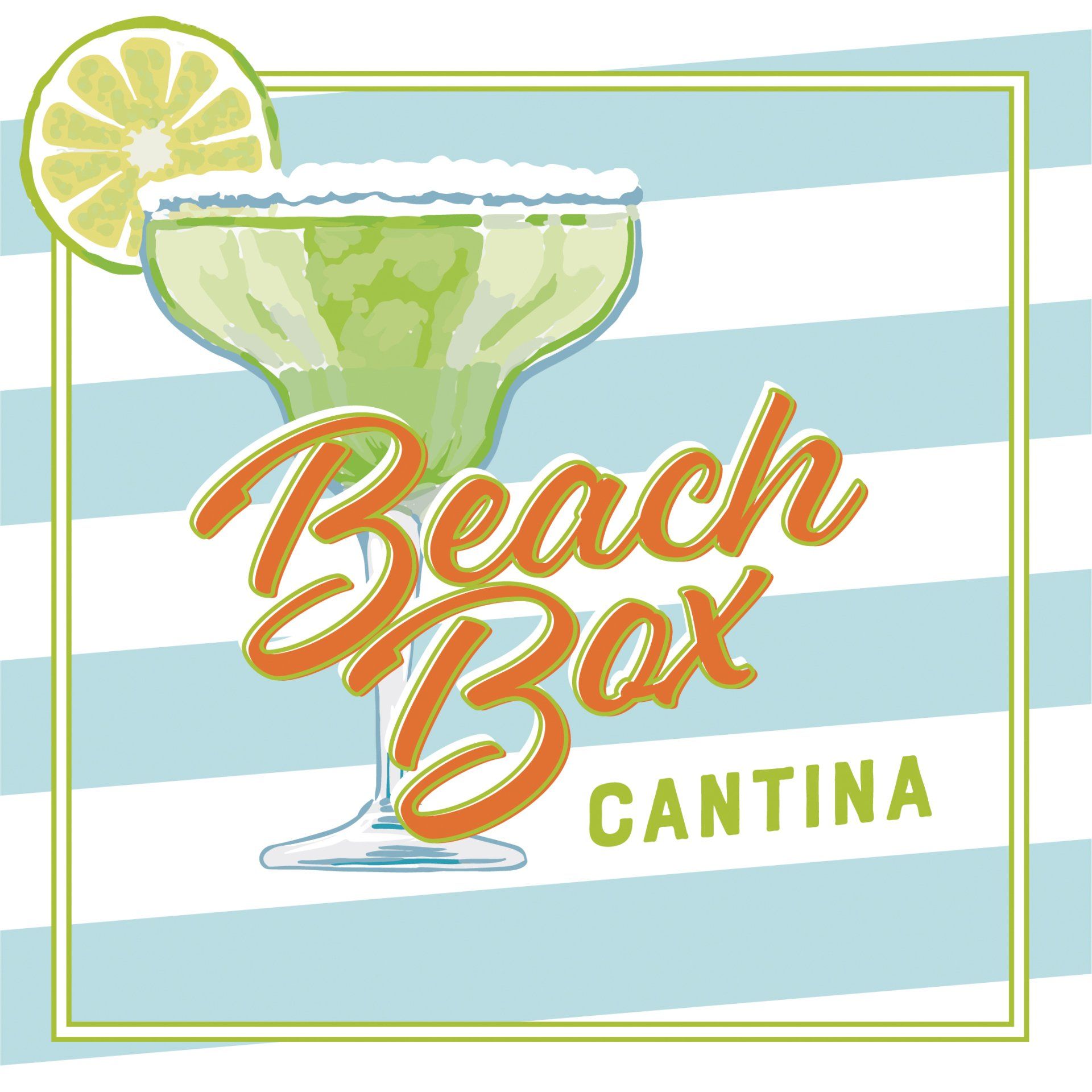
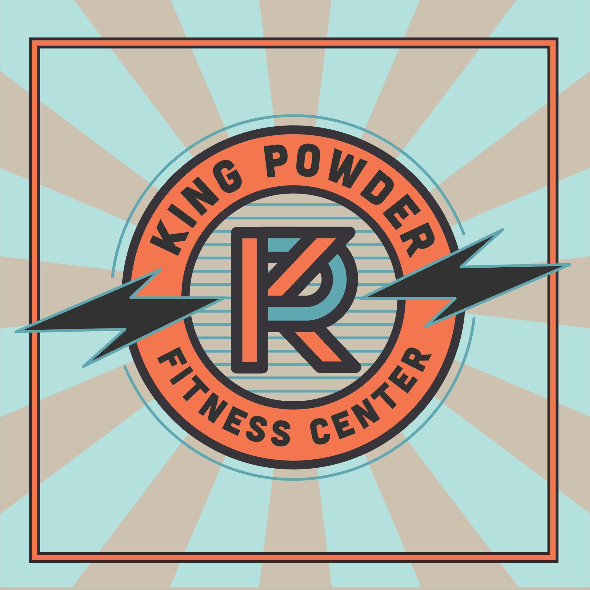
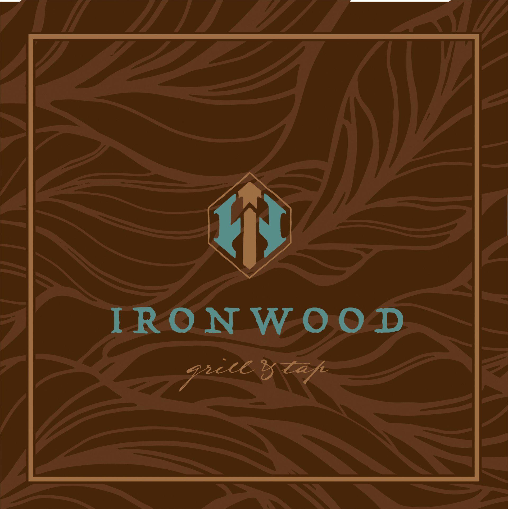
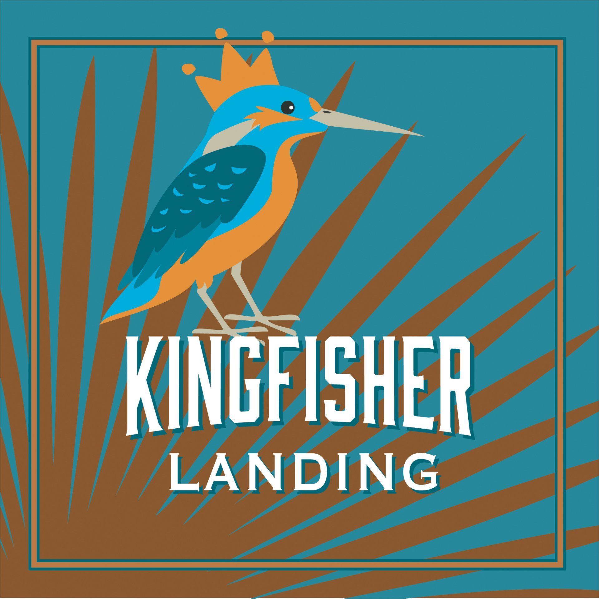
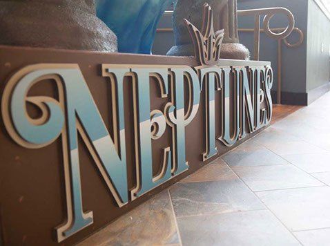
PARK SIGNAGE
Using a limited color palette, I developed a coordinated series of signage for placement throughout the resort for the water park, food court, lodge and restaurants. Much of the art is hand-illustrated in Procreate.