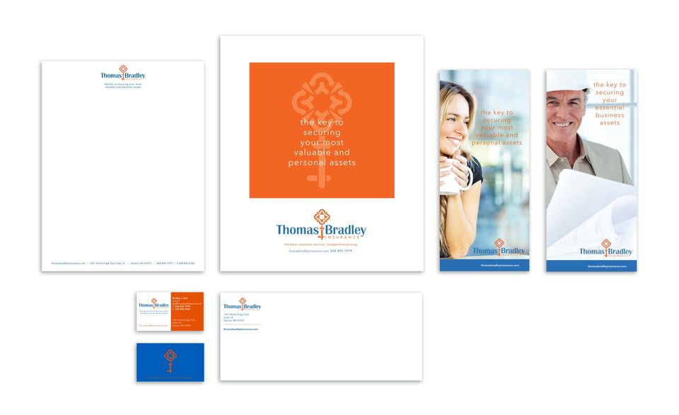
Thomas Bradley
Artica Design and Savvy Owl Marketing were assigned the task of re-naming an existing insurance company, designing a logo, website and various support materials.

After several brainstorming sessions, the client chose the name Thomas Bradley, a combination of two parter names. They wanted a key symbol and chose the colors of orange and blue. I designed a key that was a bit out of the ordinary and different enough to be recognizable and stand out as their symbol.
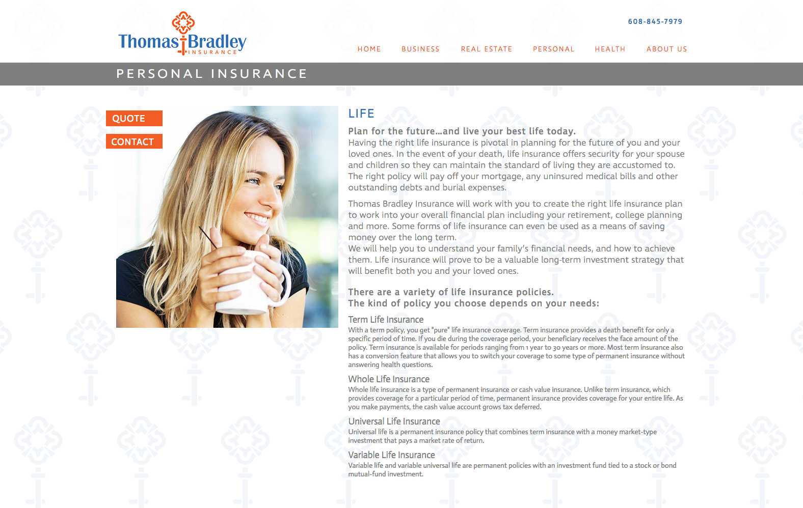
WEBSITE DESIGN
Thomas Bradley wanted a site to encompass all of the areas they service. They wanted to be approachable and be on the side of their customers and clients, filled with lifestyle images.


PRINT MATERIALS
To accompany their new logo and website, several printed pieces were developed to assist the agents in promoting the business