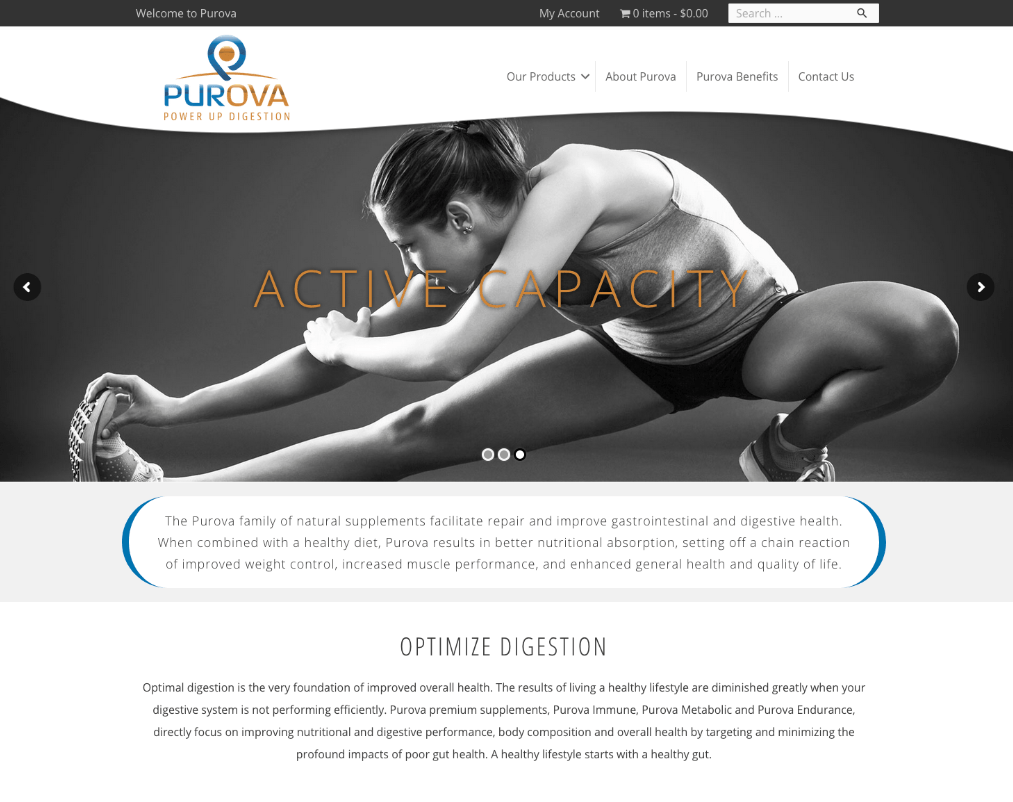
Purova
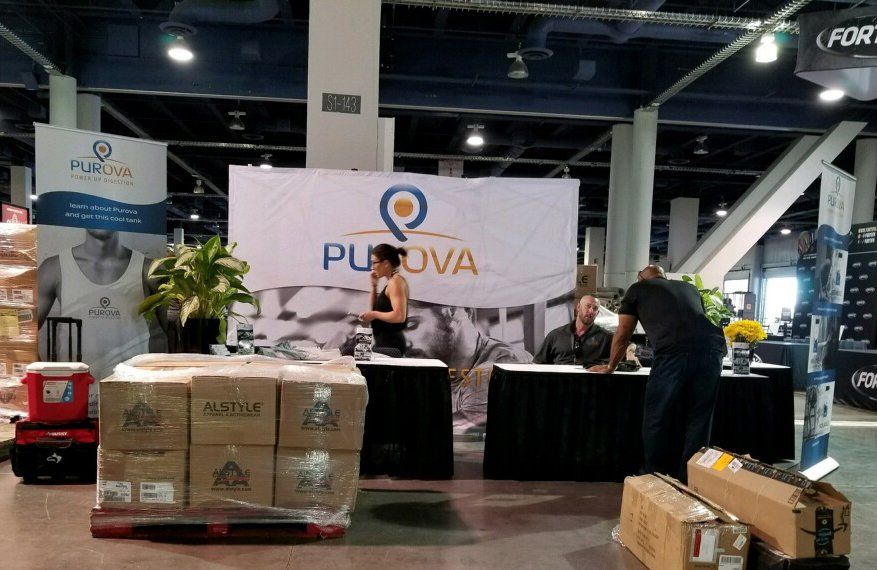
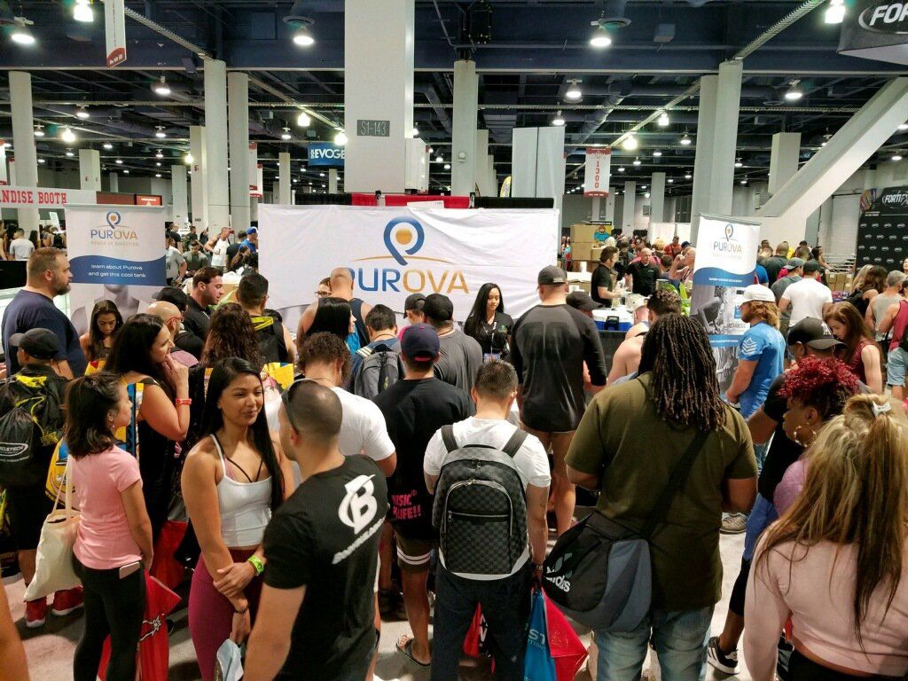
Artica Design was contracted in conjunction with Savvy Owl Marketing in Wisconsin to develop a brand identity and product launch for Purova, a digestive supplement that aids digestion targeting three markets: body builders, athletes and seniors.

A logo is the foundation of the look and feel of a company. "Purova" is a combination of two words: pure and ova. The product itself is derived from eggs. The mark in designed in the shape of an egg with the P emerging from the negative space. Soft yellow gold reiterates the yolk of the egg and is complimented with a gorgeous blue. The design and the font have curves and soft edges but at the same time has strength and a strong presence.
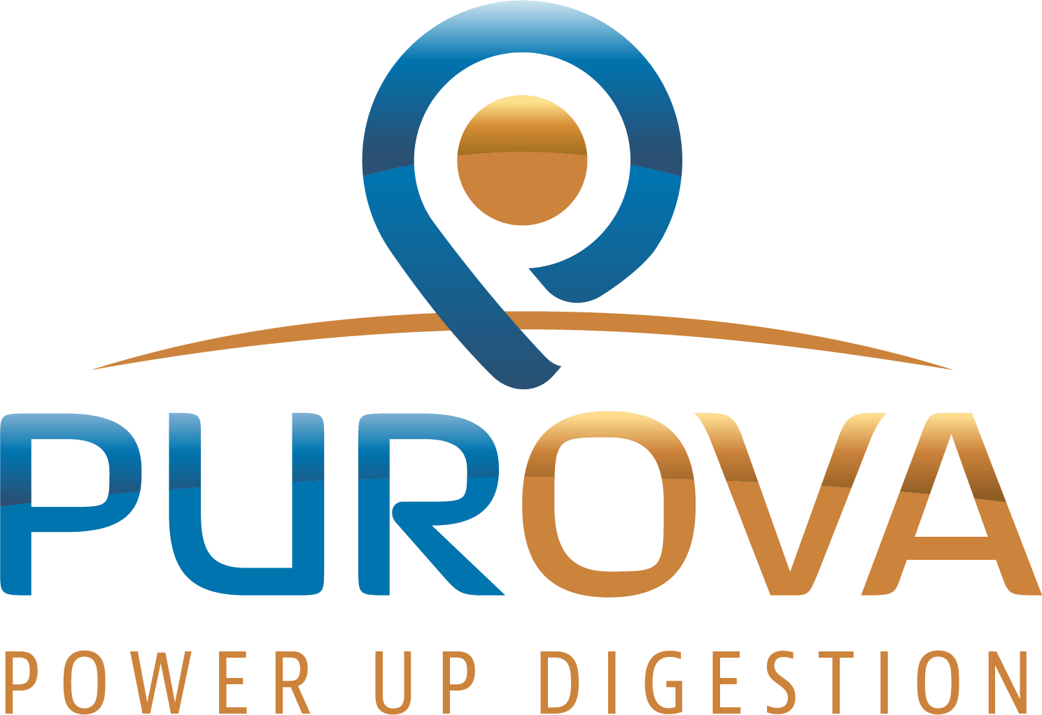


In targeting the three markets, four colors are used exclusively: Purova blue and gold, with black and white, with strong images for each product line, converted to high contrast HDR giving the Purova Brand a very recognizable look and feel.


DIGITAL ADS
To boost booth attendance, a series of digital ads ran during the show.


WEB DESIGN
Artica Design worked in confluence with Dave Clark and Erin Ruppenthal to design the Purova Website